Quantcast
Channel: FAT Paint

Meet A Retailer: Sue Griffiths from Village Craft and Candle

$
0
0


Ceramics. Paper tole. Candles. Soap. You name it, Sue Griffiths makes it.

Sue fancies herself a crafter. Creating beautiful things with her hands has always been a huge part of her life—pretty much since the day she was born, she jokes—so it was inevitable she would incorporate that love into a full-time career one day.

That opportunity presented itself 20 years ago after the birth of her second child. Her son faced some health challenges, so Sue left her her job in administration to take care of him. That experience actually turned out to be a blessing-in-disguise as Sue was able to reignite her passion for arts and crafts, which eventually lead her to her own small business in St. Mary’s, Ontario.

Village Craft and Candle is a wonderful little “poke and ponder” shop. It’s full of unique treasures: hundreds of different kinds of candles, which are made on site, along with wall art, home decor and giftware. The shop had always satisfied Sue, but she felt there was something missing. Just this past summer, she decided it was time to tackle another adventure. That adventure is FAT Paint.

FAT crew sign after Sue Griffiths 1

“I was looking to create a new buzz in the store because our community is very crafty and always looking for new things to do,” says Sue. “From cloth to wood to furniture, FAT Paint is perfect for small projects as well as big pieces. There are so many possibilities!”

As a small business owner herself, Sue says she gravitated towards The FAT Paint Company’s start-up story: a brother and sister determined to take the chalk-style paint world by storm! She also says she appreciates the personalized care and support she has received from TFPC’s small, yet mighty team.

“I’m so excited for this venture!” Sue says. “FAT Paint is not available within an hour’s drive from the store, so becoming a FAT Paint retailer has already made us special.”

As owner of Village Craft and Candle, Sue often finds herself doing a lot more admin work than the hands-on fun stuff, but now that she has brought FAT Paint into the mix, she is determined to get back into teaching more than just candles and soap.

Sue will lead FAT Paint workshops and instil a new tradition inside the store: Fun FAT Fridays. She and her team plan to take on a new FAT Paint project every week, and show off their work on their Facebook and Instagram channels.

“FAT Paint will be my new hobby. I had great results right from the start. I can’t wait to try layering colours and playing with all the FAT Wax finishes. I miss creating all the time, so this should be a blast.”

===

The FAT Paint Company has more than 140 retailers across Canada and the US with more joining every month. If you want to become a retailer yourself, please email: becomearetailer@fatpaint.ca.

If you know of an awesome shop that should retail FAT Paint, please let us know! We’re offering a $200 Finder’s Fee to anyone who helps us make a connection with a new retailer; you get the FAT cash when they stock FAT Paint on their shelves.

The post Meet A Retailer: Sue Griffiths from Village Craft and Candle appeared first on FAT Paint.


French Farmhouse Style: How to create this FAT-tabulous look yourself! – Guest Post: Camille from The Urban Upcycler

$
0
0

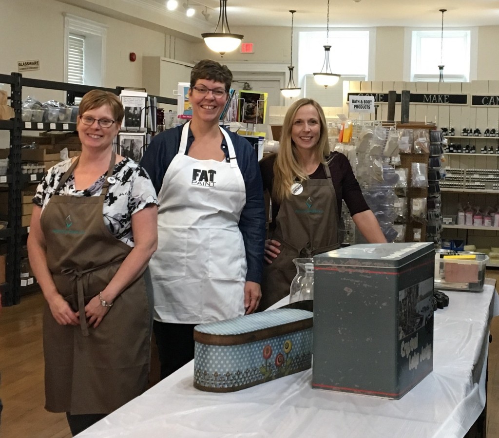
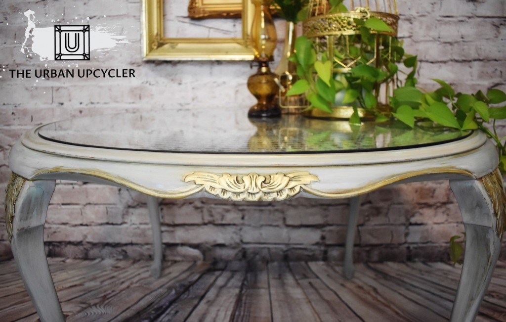
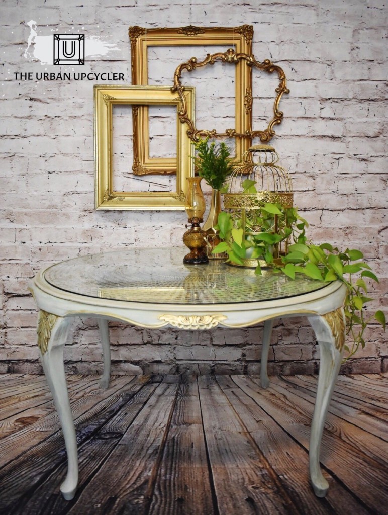
We’re thrilled to introduce Camille from The Urban Upcycler in Ottawa, Ontario; a talented artisan that does FATtabulous things with FAT Paint! Camille has been transforming furniture from shabby to chic since February 2017. We are inFATuated with her passion, talent, expertise and techniques… they leave us inspired and speechless every time! This French Farmhouse in inspired table caught our eye and we could not resist but to ask Camille to share her process with us. We’re so happy to feature her on the TFPC blog for her first guest post, “spilling the beans” on how you can achieve this look with FAT Paint too!

the final look table - to post

Hello!

My name is Camille, and I am The Urban Upcycler. I am a FAT Paint furniture artisan based out of Ottawa, and in this blog I will be sharing the technique I used to create this fun French Farmhouse-style table! But first…
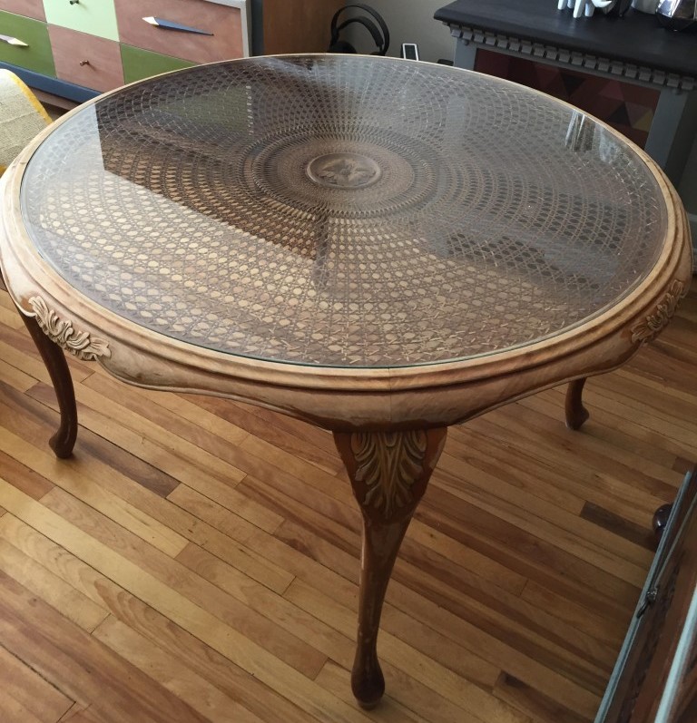
THE BEFORE:

before-768x1024

This French Farmhouse table was recreated in FAT paint for the Helping with Furniture 12th annual gala in Ottawa on April 20, 2018, and it will be featured during the live auction. I hope you challenge yourself and take a shot at creating something beautiful for yourself or a loved one!

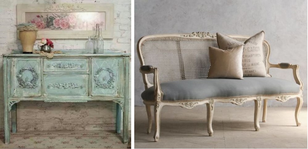
When I originally saw the table, I knew I wanted to give it a French Farmhouse-style look. Before I began this transformation, I found a few inspirational pictures on Pinterest to help guide me:

Inspiration 1

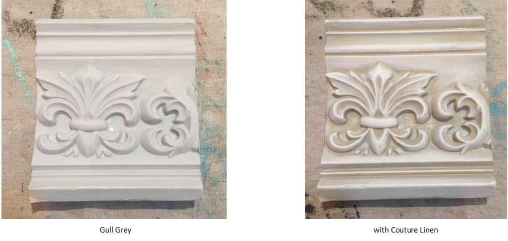
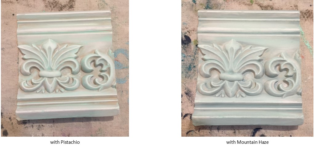
Once I had an idea of how I would achieve this look, I checked out the FAT Paint colour palette to see what would do the trick, and this is the colour combination I used:

Supplies from the FAT Paint line:

  • FAT Paint in Gull Grey
  • FAT Paint in Couture Linen (from the “Amanda Forest Collection”)
  • FAT Paint in Pistachio
  • FAT Paint in Mountain Haze
  • CLEAR Top Coat
  • Specialty GLAZE in the colour Raw Umber

Depending on the look you want to achieve, The FAT Paint Company has a variety of whites, greys and soft blue hues that would be perfect to create the French Farmhouse-style piece of your dreams!

Lastly, I used the Annie Sloan Bright Gold Gilding Wax for the finishing touch on the hand-carved details of this piece.

You’ll also need:

Preparation Process: 

I am a firm believer in properly prepping a piece before painting to ensure it is durable and will be loved for a very long time! That means making sure that the surface is properly sanded and thoroughly cleaned with mild soap and warm water before it is painted.

This particular piece was a well-worn antique table; therefore it did require some minor repairs. I reinforced the legs with Lepage Carpenter Glue, and replaced the glass tabletop.

Applying the Technique: Layers, Layers, Layers!

Since this was my first attempt at creating a French Farmhouse-style piece, I was pretty much flying by the seat of my pants. I am quite happy with the outcome!

Step 1: Gull Grey

I used Gull Grey as the base coat for this piece. It’s a beautiful, soft grey colour that adds a lot of dimension to the piece once all of the other layers have been applied.

Picture4Step 2: Couture Linen

Now here’s when you’ll start applying a different technique. I used a paint washing technique in steps 2 through 4. What this means is that I applied each colour with a paint brush, but then I removed any excess paint with a damp shop towel. So before you begin applying a new colour, be sure to have some damp shop towels ready for use.

Let’s start with Couture Linen. I applied Couture Linen because I thought it would add depth to the details of the piece. I applied Couture Linen on top of the Gull Grey base coat, and I used the damp shop towel to wipe off most of the Couture Linen, but I wanted to keep this colour in all of the creases.

Step 3: Pistachio

Once the Couture Linen paint has dried, then you can apply some Pistachio. At first, Pistachio will seem a little bright for the look we want to achieve, but it is the perfect contrast colour to complement the most prominent colour of this piece – Mountain Haze.

I applied Pistachio on top of both colours, but I tried to avoid some of the creases where there was Couture Linen. So I would focus mostly on the raised areas, and then I wiped off any undesired paint with a damp shop towel.

Pic 2Step 4: Mountain Haze

Lastly, I applied Mountain Haze, which beautifully ties all of the colours together. Since Mountain Haze is the primary colour for this piece, I applied it on the majority of the raised areas, but I was careful not to hide all of the Pistachio. Then I used a damp shop towel to remove some of the Mountain Haze until I achieved my desired look.

Seal

Seal with CLEAR Top Coat

Seal & Protect

Once I was happy with the layered colours of the piece, I allowed 24 hours for the paint to cure before I applied the CLEAR Top Coat. It is important to apply the Top Coat before using the GLAZE because it will provide a protective finish and prevent the GLAZE from seeping into the porous paint.

Glaze It Up!

Now that the Top Coat is applied and cured, it’s time for the fun part – GLAZE!

The trick with GLAZE is that you can use as little or as much as you want to create the effect you desire. It’s always a good idea to apply one layer at a time because it does dry darker than it looks when it’s still wet.

Full Disclosure: I’ll be honest; I applied the White Specialty GLAZE first to add more dimension and texture. However, since my colours were a little bit on the lighter side to begin with, it did not add as much effect as I was looking for. Therefore, I would certainly suggest using the White GLAZE for slightly darker colours when creating this look.

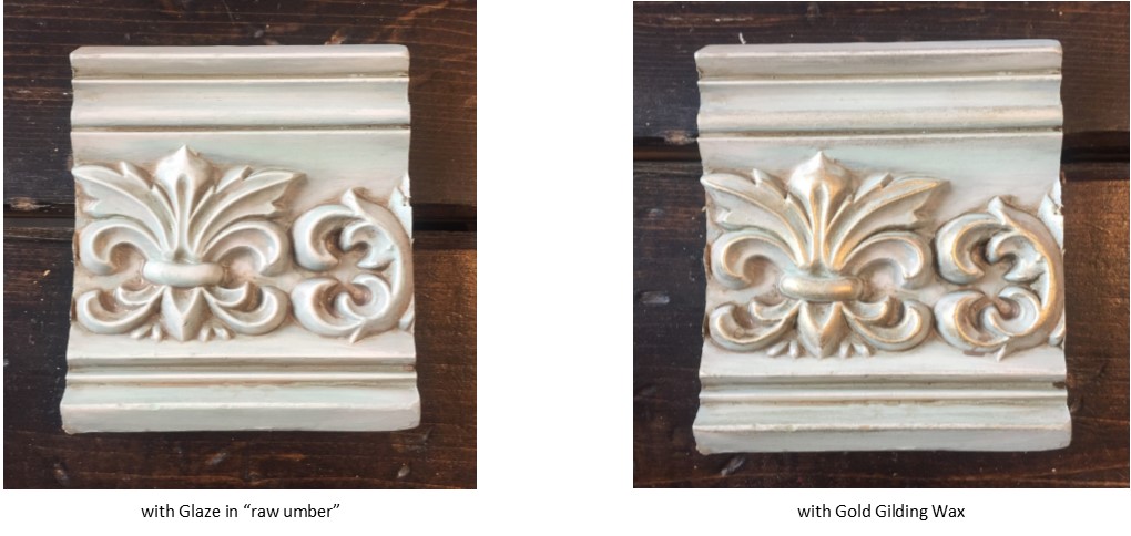
Secondly, I added the Raw Umber Specialty GLAZE. In this step, we will be using the same paint washing technique mentioned above. When applying the glaze, I used small paint brushes that I purchased at Micheals or Dollarama. Since the glaze dries quickly, you’ll want to work on small sections at a time. Once the glaze is applied, use a damp shop towel to wipe off any excess glaze.

I applied the Raw Umber glaze in all of the creases and small details of the piece to add more dimension and accentuated the beautifully hand-carved details. I also chose to use the Raw Umber glaze on some of the major parts like the legs and the table top to create more of a vintage look.

Picture6

How About Some Bling?

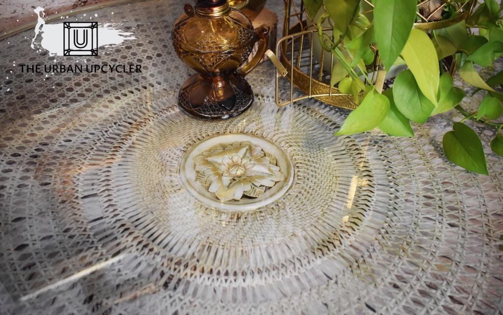
I’m a HUGE fan of metallic, so you’ll usually see a bit of gold, silver or copper on my pieces. For this piece, I thought the Bright Gold gilding wax would be the perfect touch of elegance and flare on all of the raised details. So I applied the gilding wax on the hand-carved patterns located at the top of the legs, the floral patterns on each side of the table, as well as the flower in the center of the table-top. I usually apply gilding wax with my fingers, but you can also use a shop towel.

Tips & Tricks

This is such a fun technique to apply and play with! If you want to create a French Farmhouse-style piece, I really recommend that you make it your own. There is no wrong way to do it! 🙂

And now The FAT Paint Company says… here, in all its FAT-tabulously amazing glory…

THE FINAL RESULT!

after 2

after 1

Guest Blog by Camille W.

You can find Camille/The Urban Upcycler on both Facebook & Instagram at @TheUrbanUpcyclerOttawa


The post French Farmhouse Style: How to create this FAT-tabulous look yourself! – Guest Post: Camille from The Urban Upcycler appeared first on FAT Paint.

6 Creative Ways to Decorate a Wall – Guest Post: Johanna Cider

$
0
0

Photo Credit: Chris Knight via Unsplash under License

If you’re planning to accessorize an empty wall space in your home, you have multitudes of options. The perfect canvas for artistic expression is a blank wall – you can use it as an opportunity to tap into your creativity, showcase your individuality and make a unique statement! A well-decorated wall can really go a long way in transforming the look and feel of an entire room. If you’re feeling stuck for ideas, here are 6 creative ways to bring your blank wall to life.

Create a Gallery Wall

 A gallery wall can tell a story about who you are and bring life to the whole room. There are many ways you could style a gallery wall. You could display a collection of your favorite artwork, prints, fabrics, personal family photos, or anything that showcases your personality and individual style. Look for unique frames that will complement your gallery art wall. You can use FAT Paint to express your creativity by adding colour to the frames, they have 58 vibrant colours to choose from! For an eclectic look, you could mix and match different colored frames to make it seem like your work has been collected over time, or perhaps give one of their FAT Waxes a try. The Antique Patina Wax is a great option for an aged look. If you’re after a sleeker, modern look, use a simple colour scheme or matching colours for your frames.

Incorporate Large Scale Art

 A gallery wall isn’t the only way to bring art into one of your spaces. Covering your wall with an oversized painting or photograph can also make a great statement. Large-scale art can give a small room a focal point and set the tone for the entire space. Alternatively, if you’re really feeling bold and creative, another great option is to create a wall mural. Whether you hand-paint it yourself or hire a professional to do it, a wall mural will certainly capture attention.

Photo Credit: Jesse Bowser via Unsplash under License

Create a Wall of Drapes

 If you want to add colour and decor to the room without painting the walls, consider creating a wall of drapes. Drapes go perfectly behind the bed, as they immediately make the space more stylish, cosy and inviting. They can also create the illusion of a big window, making it an ideal addition to windowless bedrooms.

Add Storage Space

 Having extra wall space can be useful if you’re short on storage. Unused walls offer lots of potential for new shelving units. There are tons of unique shelving designs that add both style and functionality to any room. You can arrange the shelves any way you like and get creative in the way you display home items.

Add a Faux Window

 If you’ve got a windowless room with empty wall space, adding a faux window can really help to liven up the room. Faux windows add depth, light and style to rooms where real windows cant be installed. For a more authentic look, you can install a real frame or even add window coverings like blinds or curtains.

Photo Credit: Mister M via Unsplash under License

 Decorate with Mirrors

Mirrors immediately make a room feel bigger and brighter. They are the perfect addition to any small room, and you can use them to decorate in a variety of different ways. One option is to create a themed display by displaying mirrors in varying sizes, shapes, styles and frames – which will add visual interest and style to an otherwise plain wall. Another option is to get an over-sized mirror that covers most of the empty wall. Very large mirrors can look great either mounted up on the wall or leaned up against it. Over-sized mirrors come in many stylish designs and can really transform your whole space.


Johanna Cider is a New Zealand-based writer who enjoys anything related to home and lifestyle topics. Her greatest passions are home design and organization, and she spends much of her free time working on new DIY projects. Find more of her work here.


The post 6 Creative Ways to Decorate a Wall – Guest Post: Johanna Cider appeared first on FAT Paint.

Buy FAT Paint On-Line!

An Ultimate Faux Finish and TFPC’s Origin Story

$
0
0
Earlier in the week this truck – an element/prop for the Amazon Prime program The Man in the High Castle – was parked beside the old New Westminster Boiler & Tank building where they were filming, just across the street from The FAT Paint Company and, as it happens, in my line of sight through the window. The amazing turquoise colour, juxtaposed against the rusted tin of the warehouse, caught my attention and imagination… calling to be photographed!
 
Here’s the thing though… it’s a fake! I mean, it’s a real and old Chevy truck, but the rust and layered-paint-look is the talented work of a scenic artist! Really!!

Full Circle Moment Here!

Bradford, my brother and business partner, was a scenic artist before we started TFPC. It was his job to create fake stuff like this truck.

It was the skill & knowledge he gained as a scenic artist that he applied to the creation of FAT Paint!

 
In fact, one of the materials they use in set building is a thickened paint they call “fat paint”. So… one day (over 6 years ago now!) as I was getting set to paint a piece of furniture, I was describing the properties of chalk paint to Brad when he made a connection: “That’s just fat paint!” He made me the version of fat paint they use on set and I loved it!
 
From there… well… that’s another story 😉

So there I was, taking photos and touching the finish on this truck… thinking about artisanship; about creating beauty…

And about how grateful I was that because of FAT Paint, Brad and I could share our love of colour and creativity with our customers!!

The post An Ultimate Faux Finish and TFPC’s Origin Story appeared first on FAT Paint.

How To Create FAT-tastic Dipped Christmas Ornaments

$
0
0

‘Tis the season to get all FAT and Merry!

One of my very favourite Christmas FAT Paint projects – ever! – are these FAT dripped ornaments. Not only are they fun to create, they’re gorgeous and make a mega-statement on the tree! They also make FATtastic gifts for hostesses, staff gift exchanges, friends. So much fun and impactful!

Another option is to drip some FAT colours on mini ornaments and then tie them on to the bow of a present. Or perhaps group two or three little FAT dipped baubles with a bow around the neck of a bottle of wine. Yes please!! Ha!!


They’re so easy to create. The ornaments I used were not smooth and shiny – they were slightly frosted, which helped with paint adhesion. The first step to transforming the baubles was to fully dip them into a neutral colour (in this case, a used “Cream”), and then I hung them to fully dry.

After that, I went crazy with dripping some FAT! I didn’t have a particular colour theme in mind. For me is was all about **Give me the Colour**!! I can totally imagine creating a colour story with 3 or 4 complimentary FAT colours though. They’d look so pretty!


I kept working around each ornament, layering my drips and colours over one another. I loved the effects that were created as colours merged and moved around one another! Just keep dripping that FAT until you’re over the moon with happiness about your results!

Now… let them fully dry. Because of the thickness of the layers, this could take a good day or more. Once they’re dry, sand them out. The primary goal is to smooth down the major drips at the bottom, otherwise you run the risk of them breaking off (sometimes they’re hollow inside). Don’t sand too much because you don’t want to lose the textured affect of the layers and drips.


The last step is spraying them with a high gloss clear coat or lacquer. My go-to brand for spray clear coat is Varathane Diamond Coat. I sprayed 3 good coats on these pretties.

Tip: keep a brush in hand and smooth out the drips that form on the bottom of the bauble.


I can’t begin to tell you how happy I was with how these FAT dipped ornaments turned out! What made me even more happy though was packing them up into individual gift boxes, wrapping them with killer bows (I’m GOOD at creating hand-tied bows! For proof positive, search out some of our Xmas videos on our Facebook page) and sending them off to each of my siblings, Dad and much-loved bonus Mom, all of whom live far from us in California. The idea that they’d hang one of my FAT dipped ornaments on their respective trees and think of me… priceless!

Go wild and create some of these beauties yourself! To purchase FAT Paint, find a retailer near you or purchase direct from us through our on-line store.

Happy FAT Christmas!!


The post How To Create FAT-tastic Dipped Christmas Ornaments appeared first on FAT Paint.

Retiring the “Amanda Forrest Collection”

$
0
0

AFC FAT Paint Colour: Blushing Bombshell


We’re sad to share that the Amanda Forrest Collection – a six colour FAT Paint palette, created by interior designer Amanda Forrest – has been retired. Amanda is making a shift in the trajectory of her design business and so between new opportunities and her regular appearances on the Marilyn Denis Show (Canada), she’s decided that folding the AFC line is for the best. Naturally, we support her decision.

WOW! It’s been a FATtabulous run!!

Over these past 3 years, the Amanda Forrest Collection (AFC) has been enormously successful. For that, our gratitude is extended to Amanda for helping us create and promote the line. What a terrific partnership! We’re also enormously grateful to all of our customers who love the colours as much as we do!!

But wait…

AFC FAT Paint Colours: “Navy State of Mind” and “Orangeapolooza”

I know what you’re thinking…

“What about ‘Navy Sate of Mind’, ‘Couture Linen’ and ‘Greysful’?! They’re my favourites!!

Or perhaps…

“I’m all about big, FAT, bold colour and that ‘Orangeapolooza’ (or ‘Blushing Bombshell’ or ‘Can’t See Me Camo’) had my name written all over it!!”

We’ve Got You Covered!!

We’re reformulating our 3 best-sellers: tweaking them a smidge to better relate to today’s colour trends

Tweak how?! Well… just like what we’re seeing in design, we’ll create a darker navy (woot!!)… we’ll take a more “Belgian linen” approach (grey it a wee bit) to a new neutral… we’ll create a medium grey without a green undertone. We’re going to take great colours and make them even more FATtastic!!

The Amanda Forrest Collection – a six colour FAT Paint palette

The trifecta of “Orangeapolooza”, “Blushing Bombshell” and “Can’t See Me Camo” are all colours that hold important places in the FAT palette overall. For that reason, we’re studying trends in search of a new orange (we’re leaning toward a terra cotta) and a green (think avocado!). Replacing the dark pink Bombshell though is a bit trickier. You see, we have a well rounded pink FAT palette. So how about we switch things up with a Burgundy or Merlot?! FAT Paint retailers love the idea, and you know they have a finger on the DIY pulse!!

TAKE NOTE that many FAT Paint retailers still have AFC stock on their shelves so if you’re looking for one of these terrific 6 colours, grab them while you can… we’re no longer producing any of the AFC colours so once they’re gone, they’re gone! HOWEVER: Until the new colours are in place, we’re temporarily producing a navy, a linen and a grey… each of which closely matches the AFC versions. Your retailers will be stocking these in small quantities. If you’re looking for one of these three colours, inquire with your retailer.

Then… watch for news as – one by one – we roll out the 6 new FAT Paint colours!!

Lastly, and of importance… thank you so much for your patience through this FAT transition!!

The post Retiring the “Amanda Forrest Collection” appeared first on FAT Paint.

French Country Inspired Fireplace

$
0
0

Artisan & FAT Paint Ambassador: Amélie from The Suburban Home


If you love French country charm, artisan, decorator and FAT Paint Ambassador Amélie from The Suburban Home is the one to follow. Case in point: this amazing fireplace makeover, achieved with FAT Paint!

Before. Amélie will use FAT Paint’s “Raven” to paint out the white trim on the fireplace surround.

Amélie started with a complete blank slate. First she used “Raven” on the trim around the fireplace, creating a more cohesive, one-colour look.


Gorgeous stencil design!


Next… out comes the stencil


Amélie used three FAT Paint colours with the stencil: “Raven”, “Blue Slate” and in the little circles, “Wasabi” (retired).

FAT Paint colour’s used: “Raven”, “Blue Slate” and “Wasabi”

Once all her work was fully dry, she distressed everything with a sanding block. After that, a light-touch, sporadically placed white-wash with “Warm White” was applied. The look of worn, aged cement tile that Amélie achieved is gorgeous!

The mantle is an amazing piece of old barnwood, but the corbels mounted below each end are the ideal finishing touch to the overall look. Amélie FAT Paint’d each corbel in first “Raven”, sealed with clear coat and then applied a couple coats of “Warm White”. She then wet sanded the white back to reveal the black. The results are FATtabulous!!

Artisan & FAT Paint Ambassador: Amélie from The Suburban Home


Artisan & FAT Paint Ambassador: Amélie from The Suburban Home


The last photo we’re sharing of the fireplace captures Amélie’s dining & living rooms… and the other FAT Paint’d pieces she has throughout her home.


Artisan & FAT Paint Ambassador: Amélie from The Suburban Home

Warm, inviting, stunning! Amélie is an enormously talented decorator and her personal style perfectly captures that French country cottage look!


We’re always grateful to artisans like Amélie who use FAT Paint to create amazing things. If you have a special project that you’d like us to feature here on our TFPC Blog, reach out to me!


The post French Country Inspired Fireplace appeared first on FAT Paint.


The Inside Story

$
0
0

Artisan: Katie from Salvaged by K.Scott ••• FAT Paint colour: “Stark”


After a lot of deliberation, you’ve selected the FAT Paint colour you’ll use to re-invent a piece of furniture. You have your tools at the ready and you’re all set to dive into the task.

But wait! Do you have a design plan?

There’s no doubt in my mind that with just making that (sometimes challenging) colour choice, you’ve tapped into a wonderful feeling of creativity. And when you pick up the brush and start laying down that first coat of FAT Paint, your creative heart is most definitely singing. The thing is, when creativity feels so darned good, why stop at colour choice and the physical action of transformation? There’s so much more! Just imagine the endorphins bursting in your brain when you take your creative spirit to the next level!!

There are lots of ways to embrace creativity when revitalizing furniture, but none more easy and immediately satisfying then paper. I’m talking about taking the extra few steps to fashion a story. A feeling. A moment. You open a drawer or cabinet door and… you’re filled with pleasure!

Artisan: Victoria from The FAT Paint Company ••• FAT Paint colour: “June” (retired)


Selecting paper to line your dresser drawers or cabinet backs is most definitely a creative design decision. Are you looking for pretty or funky? Is this for a child’s dresser or a dining room buffet? Do you want to open the drawer and smile at the unexpected quirkiness (like the eye lash paper above), or do you want clean classic stripes (see below)? The paper you choose has everything and more to do with the overall personality you want your piece of furniture to embody.

In fact, you may find it easier to first select the perfect paper and then – using the paper as a colour and/or personality guide – select your FAT Paint colour. Of course most of the inspiration photos in this post showcase papers that coordinate with the paint colour and not specifically “match”. Regardless of your approach, have fun and embrace your creative heart!

So where do you find paper?

  • One source is the gift wrapping section at local stores. I recently watched FAT Paint Ambassador and amazing furniture artisan Katie from Salvaged by K.Scott (IG: @salvagedbyk.scott) do a series of Instagram Stories of her search for the perfect mermaid wrapping paper. She hit Walmart and her local dollar store, but eventually found the most perfect scallop-designed paper at the Hallmark Store. To see the paper she found – and the FATtabulous purple & turquoise blended bedside table she put it in – head over to her IG feed and scroll down a little!
  • Wallpaper is a great option. What I love about wallpaper is – like wrapping paper – it comes in rolls. And that means that you should have enough to line all the drawers in a dresser… and maybe even all the drawers in a second dresser. Hit up design shops to see if they have discontinued rolls in stock. These rolls may be “last design season”, but they’re still gorgeous… and less expensive per roll! Another option is the design section of Home Depot or Lowes. Options are limited, but I found the shimmery neutral brocade print (photo below) at Home Depot.
  • My most favourite option for pretty paper is stocked at a very special paper-loving store here in Vancouver called Paper-Ya. They stock large format (about 18″ x 36″) sheets of a variety of decorative paper designs. The photo below shows some of the papers I purchased from them. I’m particularly in love with the pink & blue botanical print!! Purchasing individual sheets of paper like this can be expensive, but the impact is straight up WOW! I encourage you to source out artisan-focused shops like Paper-Ya in your area!! (another option for sheets of artisan paper is De’Serres, Opus, or art stores local to you)
  • Design your own paper! Spoonflower is an awesome on-line resource for printing your designs!! They also have a gorgeous inventory of other designs that you can purchase too.
  • Drawer lining paper. Yep… actual paper for lining drawers. I haven’t found a reliable source for this kind of paper. The box shown in the photo below was a lucky find at HomeSense (Marshals in the US). Actual shelf lining is an option, but admittedly I’m not a fan.
  • I once lined the drawers of a bedside table with a decoupage of torn up tissue paper! The results were so awesome, but unfortunately I couldn’t find a photo to share with you.


Paper options galore!


And now… apart from the occasional design tip, no more words… just inspirational photos! Where available, I’ve linked the photos to their makers’ websites or Facebook pages. Go check them out!


Artisan: Marijana from Studio 3 Interiors ••• FAT Paint colour: “Antique Wedgewood” with white FAT Wax


Artisan: Katie from Salvaged by K. Scott ••• FAT Paint colour: “Warm White”


Design Idea: Consider lining the top drawer of a 3+ drawer dresser in a different paper, especially if the top drawer (or drawers – some have two or three on top) has a different face design. I love this idea! It’s important that the papers compliment one another as well as the personality you’re working to create for the furniture piece.


Artisan: Katie from Salvaged by K. Scott ••• FAT Paint colour: “Piri Piri”


Artisan: Victoria from The FAT Paint Company ••• FAT Paint colour: “Blushing Bombshell” (retired)


Artisan: Kim from Paint That Pretty ••• FAT Paint colour: “Gull Grey”


Click on photo to navigate to the Whitney's blog post.

Artisan: Whitney from White House on the Square ••• This piece is not FAT Paint’d, but shared because it’s a perfect example of an “Inside Story”. And because it’s so darned cute!


Design Idea: Pretty paper isn’t just for lining drawers and the inside of cabinets. Bring character and personality to your dining room or kitchen by papering the back of your china cabinet!

Tip: If you don’t want to permanently adhere the paper to the back of an open cabinet, try this:

  • Cut 1/4″ MDF boards to the dimensions of the inside back of your cabinet. If the shelves are removable you may be able to cut one piece to fit the back, but that will depend on the depth of the shelf (Will the shelves fit into the cabinet if there’s a board taking up room in the back? If no, cut separate boards that fit in around the shelves).
  • Prime both sides of the board(s) because water in the glue you use may cause the MDF to warp.
  • Adhere paper to the MDF. Allow to dry.
  • Place the board(s) into position. They should stay in place but if they don’t, double-sided tape should do the trick… as will the items you place on the cabinet shelves (have a few larger items leaning/standing against the back [a plate for example]).

Artisan: Amelie from The Suburban Home. FAT Paint colour: “Ocean Spray” (retired)


I hope you’ve found some inspiration in this post! Be bold, have some FAT fun, embrace creativity in all you do and always, always shine!

The post The Inside Story appeared first on FAT Paint.

PRIMED and Ready!

$
0
0

We’re so excited to introduce the newest product in our Artisan Paint Line: PRIMED!!

So why “PRIMED: Clear & Bonding”?

Yes, FAT Paint has really great adhesion… 90% (or so) of the time. Sometimes though you encounter a frustrating substrate that wants to resist the paint. Here’s the scene:

  • After the first few stokes of FAT Paint you can tell that the paint isn’t adhering because the coverage is streaky (you may see the paint “pulling away” from the surface and back towards itself), or…
  • Application of that first coat was okay, but the second coat “re-activates” the dry first coat so with each stroke, you’re pulling off paint, or…
  • Two coats were applied but the moment you scratch the surface in any way (a finger nail, a sanding sponge), paint pulls away, or…
  • Two coats were applied successfully, some sanding was even done to distress… but application of a clear top coat “re-activates” the dry coats and pulls off paint.

Argh!

There’s no doubt about it… these are bonding issues

Solution: The application of a bonding (also knows as high adhesion/adhesive) primer prior to FAT Paint.

With the introduction of this new product in our artisan line, you’re now PRIMED and ready to solve your adhesion problem!

There’s one thing that makes PRIMED different from other bonding primers on the market.

IT’S CLEAR!

Why is this a good thing?

Imagine that you want to create a primitive (highly distressed) farmhouse finish on a windsor chair using a bold colour like Red Barchetta, but that chair has a factory hard-coat finish on it that resists paint. Now imagine that the solution is a white bonding primer. You want worn red with significant wood reveal… you don’t want a red & white chair.

To the rescue: clear and bonding PRIMED… hello to distressing without revealing white primer!

Factory hard coat pushing the paint away? Or maybe you want to FAT Paint that IKEA “Malm” dresser? Melamine laminate, plastics or ceramic tile?

Get PRIMED!

Find your nearest FAT Paint Retailer HERE

Order PRIMED, FAT Paint and our other artisan paint line products HERE

The post PRIMED and Ready! appeared first on FAT Paint.


Latest Images